Phipps Stories

#bioPGH Blog: Five Databases You Can Explore at Home
 A resource of Biophilia: Pittsburgh, #bioPGH is a weekly blog and social media series that aims to encourage both children and adults to reconnect with nature and enjoy what each of our distinctive seasons has to offer.
Hello, readers! Like many of you, I am currently working from home to help slow the spread of COVID-19. Our families, friends, and communities are a top priority for us all. I thank you all for joining me today in this strange time, and I hope I can spark your sense of wonder a spirit of inquiry — and don’t forget, the outdoor world still beckons and you can enjoy that even while social distancing.
This week our focus will be a little different. For those of you who are learning or teaching from home, I thought this week it would be fun to explore some readily available science databases! They are the perfect way to spice up a math lesson or fix a concept in practical application. Students can ask questions about a subject they are interested in, and then answer their own question with real data. And these are a very limited few of the many public databases available for exploration — happy exploring!
Bugs and Bugs and Bugs
If you like your creepy-crawlies (and you should) the US National Entomological Collections available through the Smithsonian are a treasure chest. You can look up your favorites groups of insects and narrow it by specimens with images to investigate! Or you can look up what has been found near where you live or some place that you have always wanted to visit.
What’s in Your Food?
How much Vitamin C is in a cup of blueberries? How does that compare to a cup of strawberries? You can find out all sorts of nutritional information from almost any food you can imagine on the USDA’S FoodData Central. This database contains hundreds of thousands of records of nutritional content from both whole and processed foods — but bring some snacks. All that food research might make you hungry!
Volcanoes!
Perhaps volcanoes aren’t at the top of Pennsylvanians minds, but any budding volcanologists out there will be very interested in the USGS tool that allows you to look at real-time monitoring data from volcanoes across the United States (from this page, select “Find a U.S. Volcano” for a drop-down list of volcanoes by state.)
For the Birds
If you’re a fellow bird nerd, you are in luck! The U.S. Geological Survey, along with Mexican and Canadian wildlife agencies, collaborate to manage the large-scale North American Breeding Bird Survey, a massive effort to count the breeding birds across the continent. You can access the raw data here (and I recommend opting for the online retrieval system), and you can look up the USGS publications that have used the data here.
NOAA – Climate Data Online
NOAA has decades of climate and weather data available online, and it can even graph itself! The easiest way to look at long-term climate data is through the Climate at a Glance tool. You can review a century’s worth of data on temperature, precipitation, maximum temperatures, minimum temperatures, etc. for every state. Below is a quick graph that I generated of the average annual temperature across Pennsylvania from 1919 – 2019.
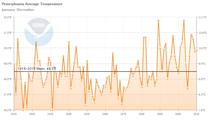
If you are interested in more of a challenge, though, NOAA’s full Climate Data Online feature is a great way to create spreadsheets and maps with specific data, but … you will get quite a bit of data. When testing out different features before writing this post, I selected precipitation, temperature and a few other bits of climate data from my neighborhood over the past century — I must have set for a few too many data points because my computer balked at the 17,000 page PDF I almost downloaded!
Asking Questions and Making Graphs
These datasets can all blend perfectly with an inquiry-based lesson, but the data sets can also be overwhelming because there is so much information. Here a few example questions you can use as a springboard for deeper learning:
- How did this data change between years? (For example, how many of a particular species of bird were spotted in the most recently available year? How many were spotted 10 years ago? How many 20 years ago? Is this trend the same of a number of species?)
- Do closely related fruits and vegetables have similar nutritional content? Why or why not? (Could lead to a discussion of plant breeding)
- Does our area get more or less rain every year than this desert or this tropical area?
If graphing skills are a little rusty, here is an easy graph using data from the National Weather Service’s page for Pittsburgh. From this page, look under the heading “Observed Weather Reports” for the Product “Preliminary Monthly Climate Data,” and hit “Go.” This will open a new window that contains high and low temperatures along with some other data for the month thus far. Then, in an Excel spreadsheet, fill in three columns with the January date, daily high temperature and daily low temperature. Next, select your daily high and low columns (including the column headings!) and while they are highlighted, select the Excel tab “Insert” and select the option for a 2-D Line with Markers Chart. Voila! If you would like to change the color of daily high and low temperatures, right click on data points and select “Format Data Series.” Of course, you may have your own favorite way to make a graph in other programs, or you may be interested in displaying other data instead. Just have fun with data!
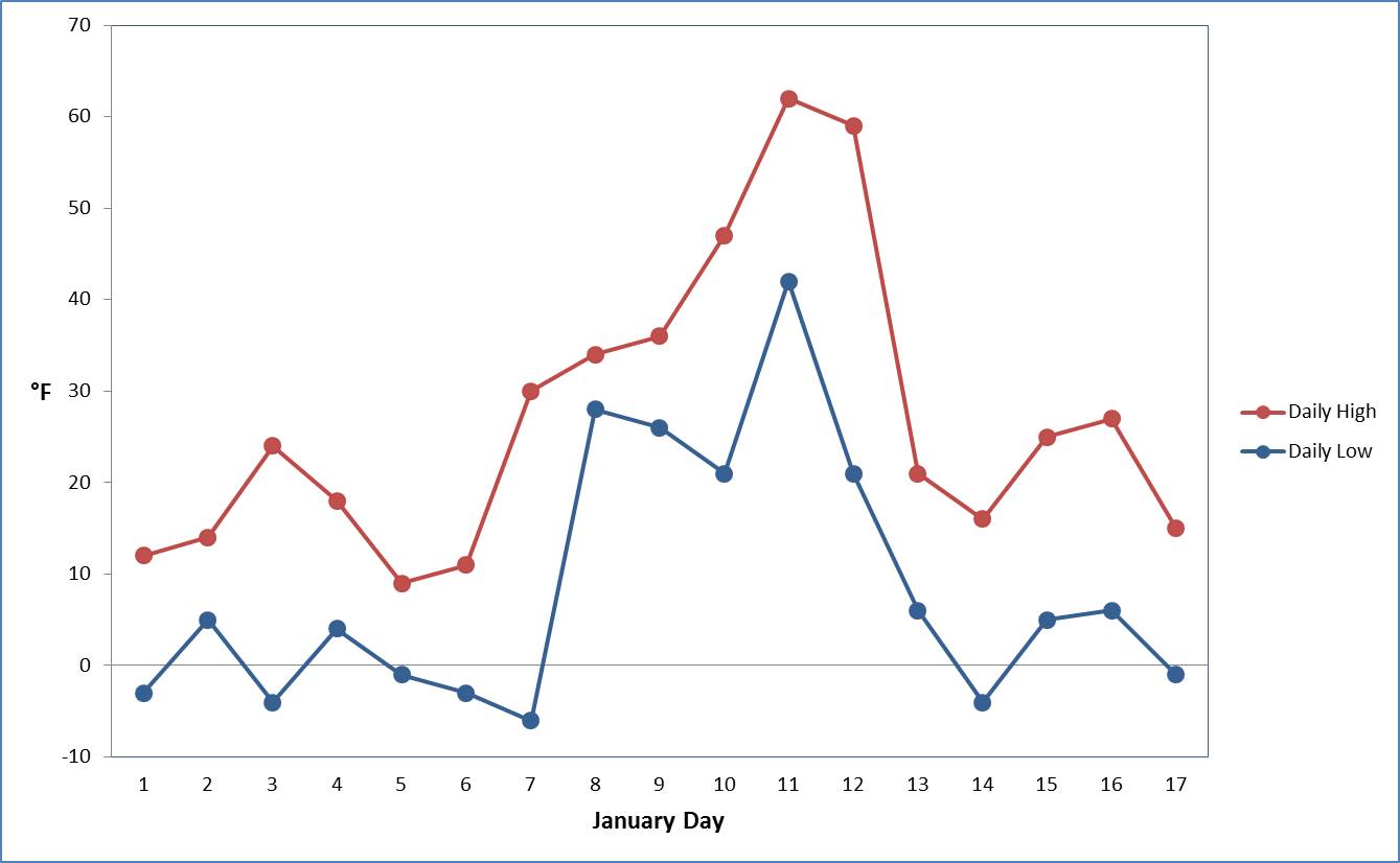
Note: This data is not from 2020.


